Data and LLM Workflows
The system ingests podcast feeds and chart data, preserves raw snapshots, parses episode metadata, and uses a multi-stage OpenAI Batch API workflow to extract likely guest names from messy titles and descriptions.
Featured Personal Project
I built an interactive podcast network analysis website that lets people explore how podcasts, hosts, and guests are connected. The project started as a playful "six degrees" idea and grew into a full data product spanning ingestion, LLM extraction, entity resolution, graph analytics, machine learning, automation, visualization, UX design, and production deployment.
The system ingests podcast feeds and chart data, preserves raw snapshots, parses episode metadata, and uses a multi-stage OpenAI Batch API workflow to extract likely guest names from messy titles and descriptions.
Raw guest names are normalized into canonical people using aliases, observations, candidate pairs, matching scores, and reviewable metadata so the graph is built on cleaner identities instead of one-off text strings.
The app builds host/guest and podcast-similarity graphs, calculates centrality and evolution metrics with NetworkX, and powers shortest-path searches, rankings, network maps, overlap analysis, and recommendation surfaces.
I trained experimental models to predict plausible future podcast-guest links using temporal train/test windows, graph structure, category compatibility, recency, repeat behavior, and activity features.
The site turns a complex graph/ML system into browsable features: Six Degrees path search, maps, recommendations, rankings, podcast and person pages, methodology notes, and caveated prediction views.
A weekly production pipeline scrapes new data, reruns extraction and entity resolution, refreshes graph metrics, regenerates plots, scores predictions, audits new links, and reports pipeline status.
Project Archive
My dad is a nature photographer and has over 1700 of his photos on his instagram account. I scrapped the photos from his account. I wanted to try out some image recommendations (i.e. show me similar photos to the selected photo) and try to see if I could properly cluster them, as a first look suggests there are certain categories of photo, e.g. landscape, elk/moose, birds, etc.

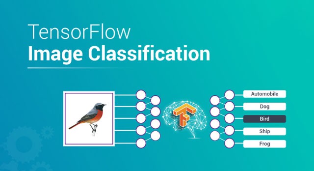
Tensorflow has great tools for image analysis and classification, so I wanted to try them out for myself. To get started I used the Intel Image Classification Dataset and follow a standard approach. Then I used a set of images scraped from google image search and experimented with transfer learning.
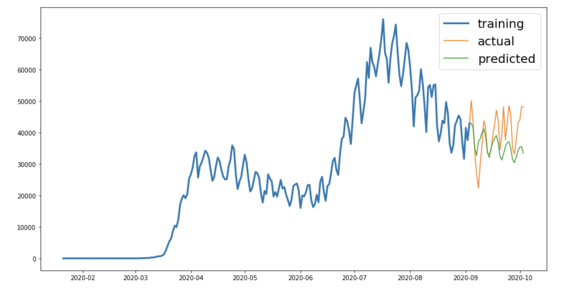
Time series forecasting involves using historical scalar data of a time series to predict future observations. I used an ARIMA model on the number of daily Covid cases in the US, which I scraped from Wikipedia. I also added the number of daily protests (downloaded from here) as an exogenous variable to the model, which resulted in a better fit to the model.
Collaborative filtering recommendation systems are fun, but it's hard to find data for it that's not proprietary. So I used a clean dataset from Kaggle, transform the data, and feed it to SVD, and test it using standard and custom methods.
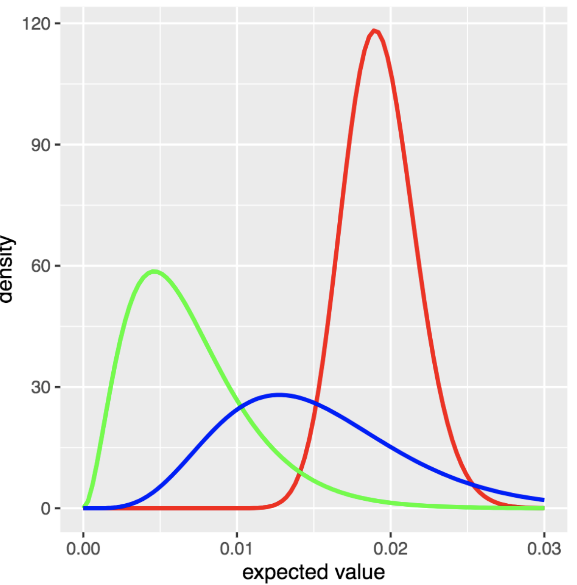
I used Thompson sampling to simulate how a website might employ ad auctions to decide which ad should be placed on the website based off the expected value. The document shows how to continuously update the model after several campaigns and how this affects the distributions of expected values. This follows this blog entry.
I used Natural Language Processing (NLP) tools to analyze Marvel Movie Transcripts from this website. I used the scraped transcripts to some classification (MCU vs. other marvel projects) and some Latent Dirichlet Allocation (LDA) to see which movies are most similar to each other. Both approaches ended up relying heavily on the names, which, due mainly to the inconsistent script structure, was infeasible to properly remove.

While I was a Data Science Fellow at Insight Data Science I worked on a machine learning web application that assists cryptocurrency investors in growing their portfolios. The web app was launched to a domain name using AWS, but has since been taken down due to costs. You can find the code to analyze the data and build the model in my github repo here and the code to build and launch the web app here.

Kaggle is a website where users can post datasets and others can post analyses, or kernels, both of which can be upvoted and be seen by more users. Companies and organizations often post competitions where they supply a dataset and offer cash prizes to whoever submits the best set of predictions. I used this site to practice and refine my python and machine learning skills. Here are a few of my submissions.

I took a graduate-level Data Visualization class in the Media and Arts Technology department at UCSB. We focused on using MySQL to query databases (specifically, checkout data for the Seattle Public Library for this course) and Processing to display and visualize the data in 2D and 3D environments. For the final project, I used data generated from MESA for a star with the same mass as the Sun from birth to death. A video from the resulting visualization is presented to the right. Souce code.